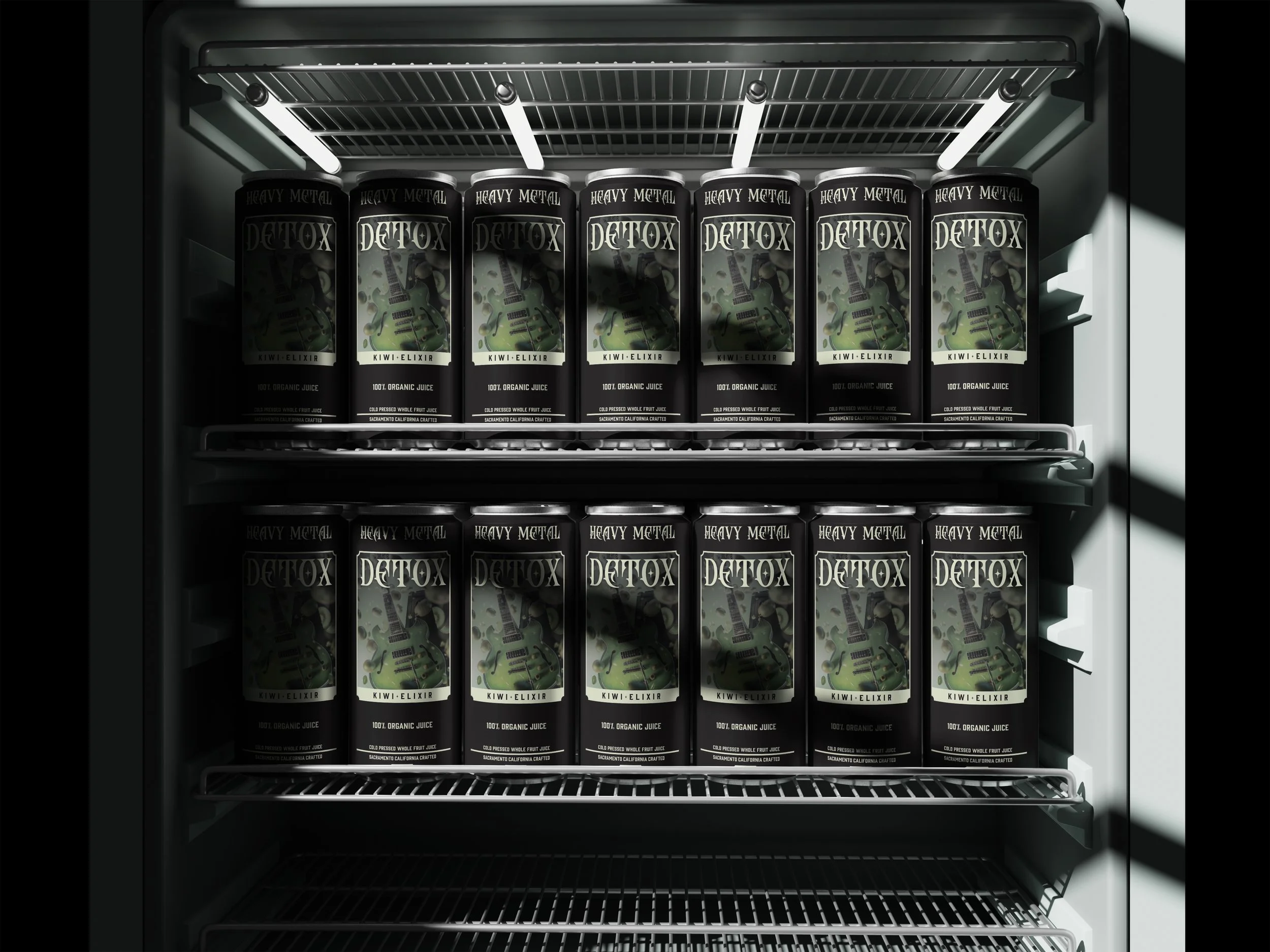
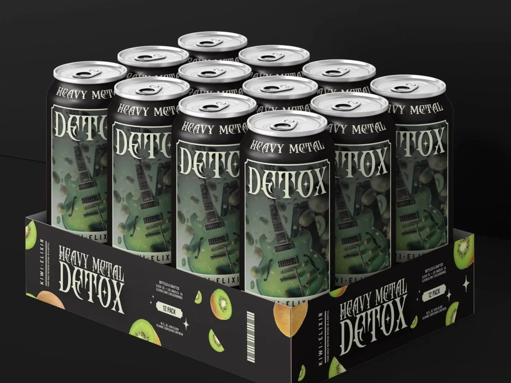
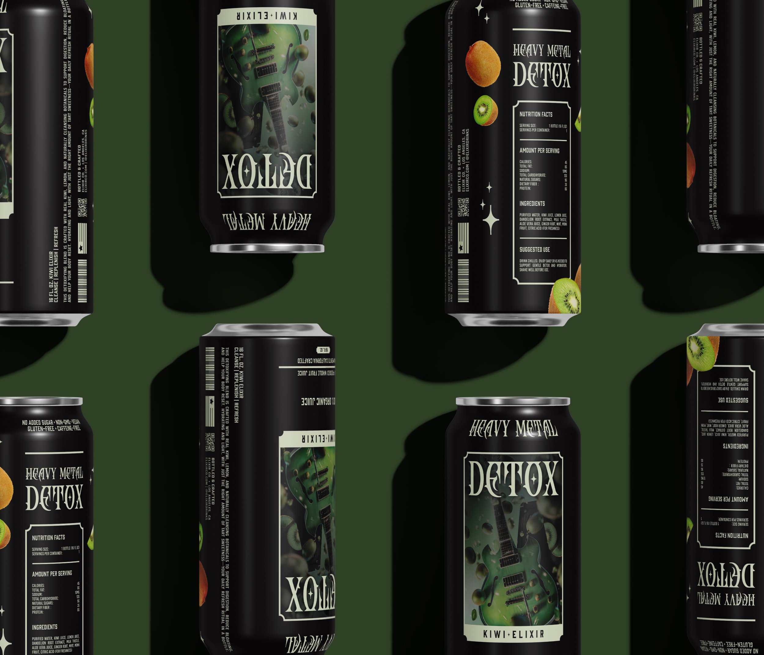
HEAVY METAL DETOX
KIWI ELIXIR BEVERAGE
Role: Brand Identity / Packaging Graphic Design / Media Assets.
Created: 2025
Project Overview: I designed Heavy Metal Detox as a high-impact wellness brand that plays on the double meaning of its name—targeting toxic heavy metals in the body with a full on rock-and-roll attitude. This project reimagines detoxing not as a quiet retreat, but as a loud, confident reclaiming of health.
Deliverables: Full label design (packaging), Product copywriting, Packaging mockups, Visual brand guidelines.
Strategy: Tone-first Brand Identity. Develop a vibrant and uplifting brand system that reflects the product’s health-boosting properties. Visual Language: fruit-inspired color palettes align with the natural flavor infusions. The branding leans into gritty textures, sharp typography, and visual cues inspired by metal album art and kick-ass vintage tour posters. The result is a drink that doesn’t whisper about wellness—it screams it.

Objective: To create a visual identity and packaging system that omits the typical soft, “clean” detox aesthetic by infusing it with the unapologetic energy of heavy metal culture—while still communicating health and utility.
Target Audience: Health-conscious consumers tired of bland, clinical detox products. Gen Z and Millennials interested in wellness, performance, and irony-forward branding. Creatives, performers, and musicians looking for something that feels personal, not pharmaceutical & bland.