turn
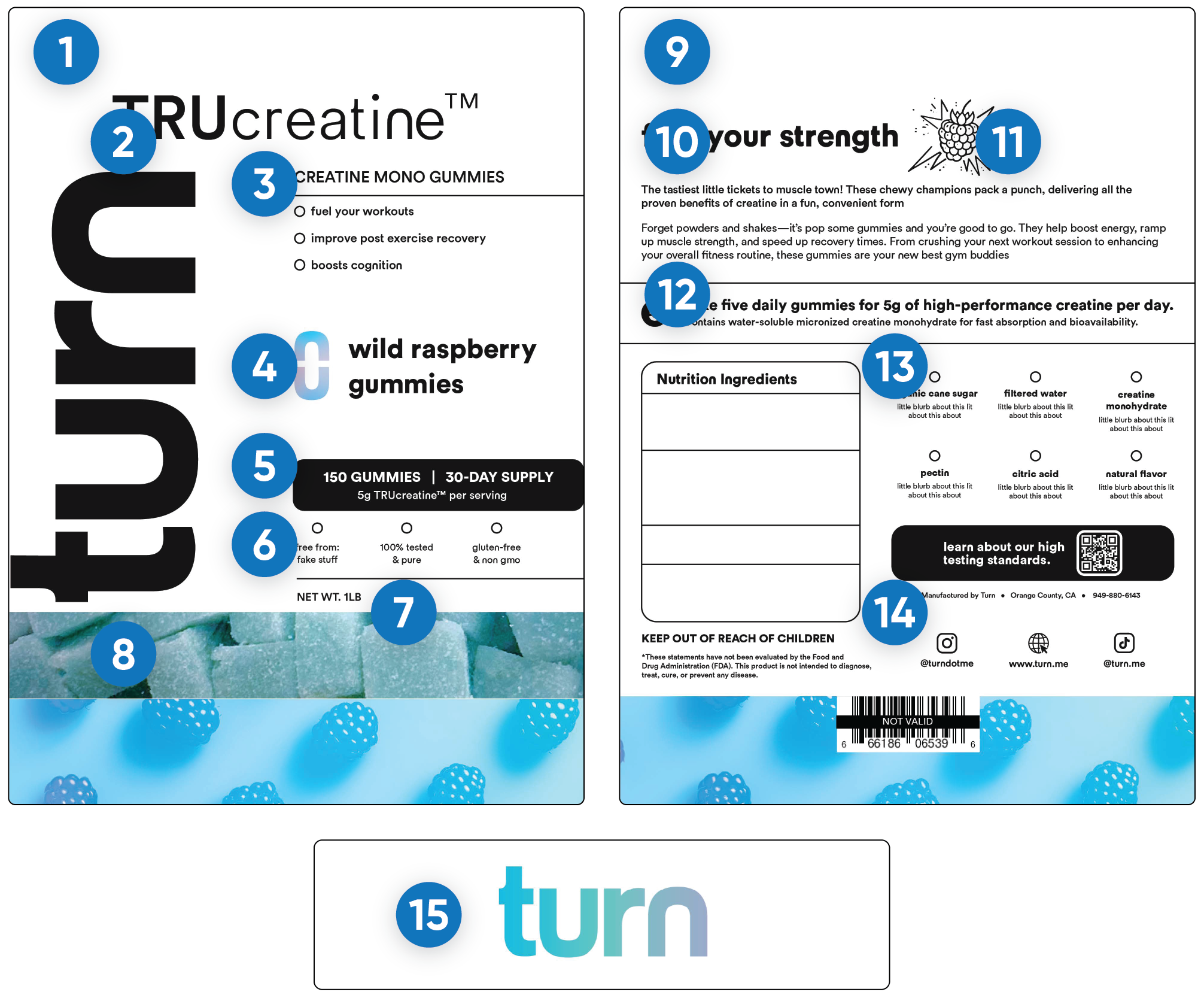
Wild Raspberry Monohydrate Gummy
Role: Packaging Graphic Design / Media Assets.
Created: 2024
Project Overview: turn is a CBD/THC brand expanding into the health and wellness space with the launch of its first ever monohydrate gummy. I was brought on to elevate their packaging through a modern, assertive aesthetic that still reflected turn's relaxed, lifestyle-driven identity.
Deliverables: Packaging design for turn’s new Monohydrate Gummy, Custom flavor-forward visual system, Layout structure and iconography development, Label design with compliance and supplement info, Product mockups and presentation assets for brand use.

turns HURDLE
PAINPOINTS
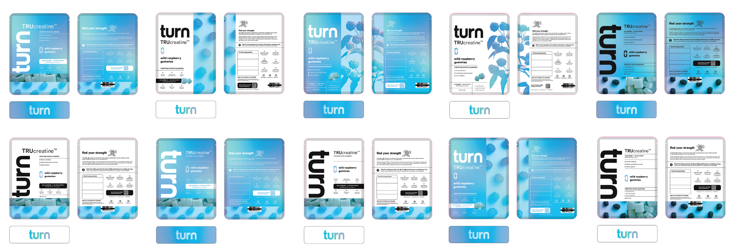
1: Turn took 10 attempts at the packaging themselves. *Pictured Below
2: The team knew something was off but was having trouble pinpointing what specifically.
Turn approached me with a clear problem: their monohydrate gummy packaging wasn’t working. After multiple design attempts, the flavor wasn’t being communicated clearly, and the product was getting lost on shelf among major competitors.
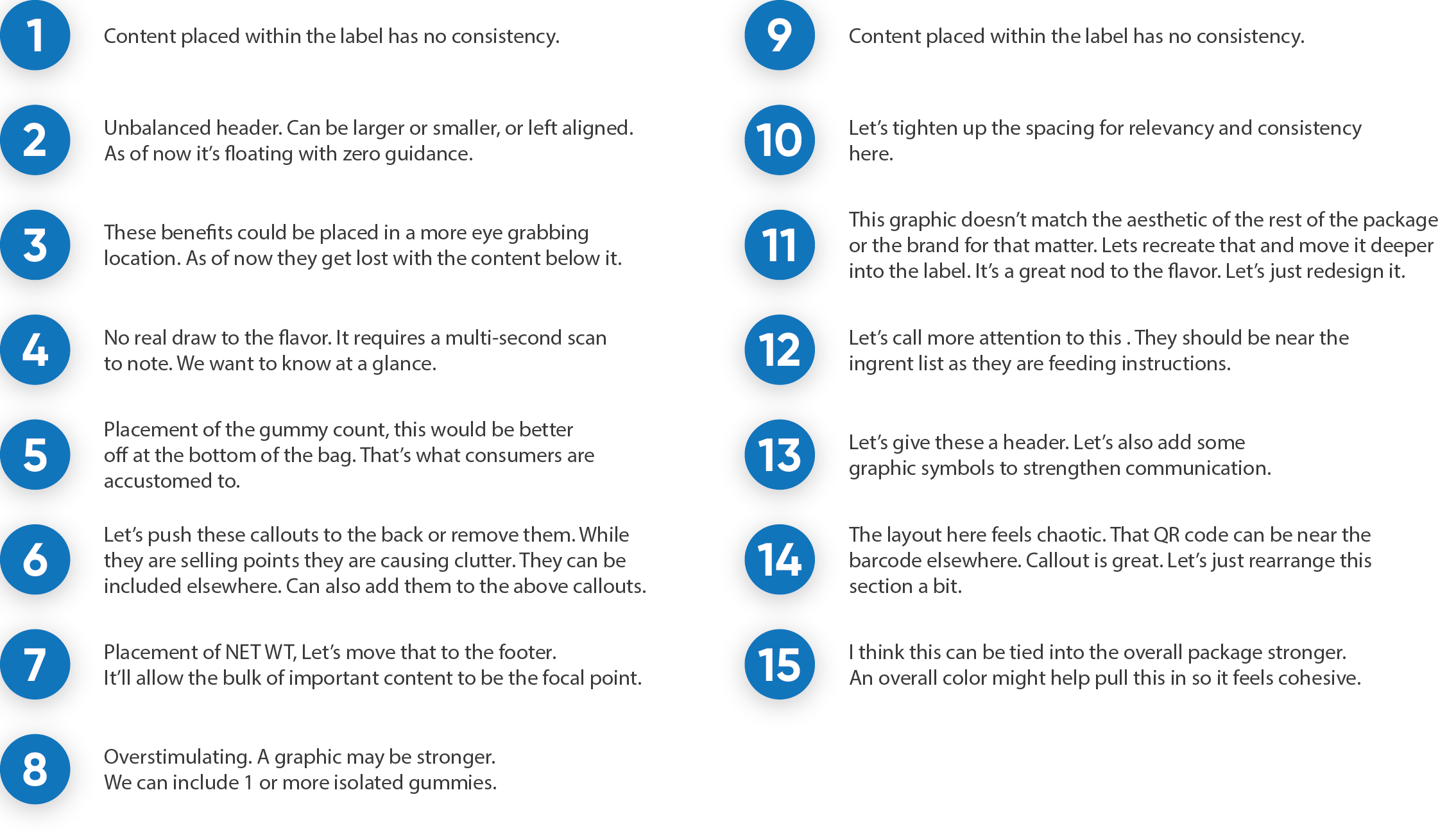
I stepped in to audit what was working, identify what was missing, and build a more effective visual system that elevated clarity, presence, and impact.
AUDIT / PLAN OF ACTION
BREAKDOWN and PLAN OF ACTION
1: What’s working and why. What isn’t.
2: Adding strength through structure, graphics, and color to increase shelf appeal.
OUTcOME / RESULTS
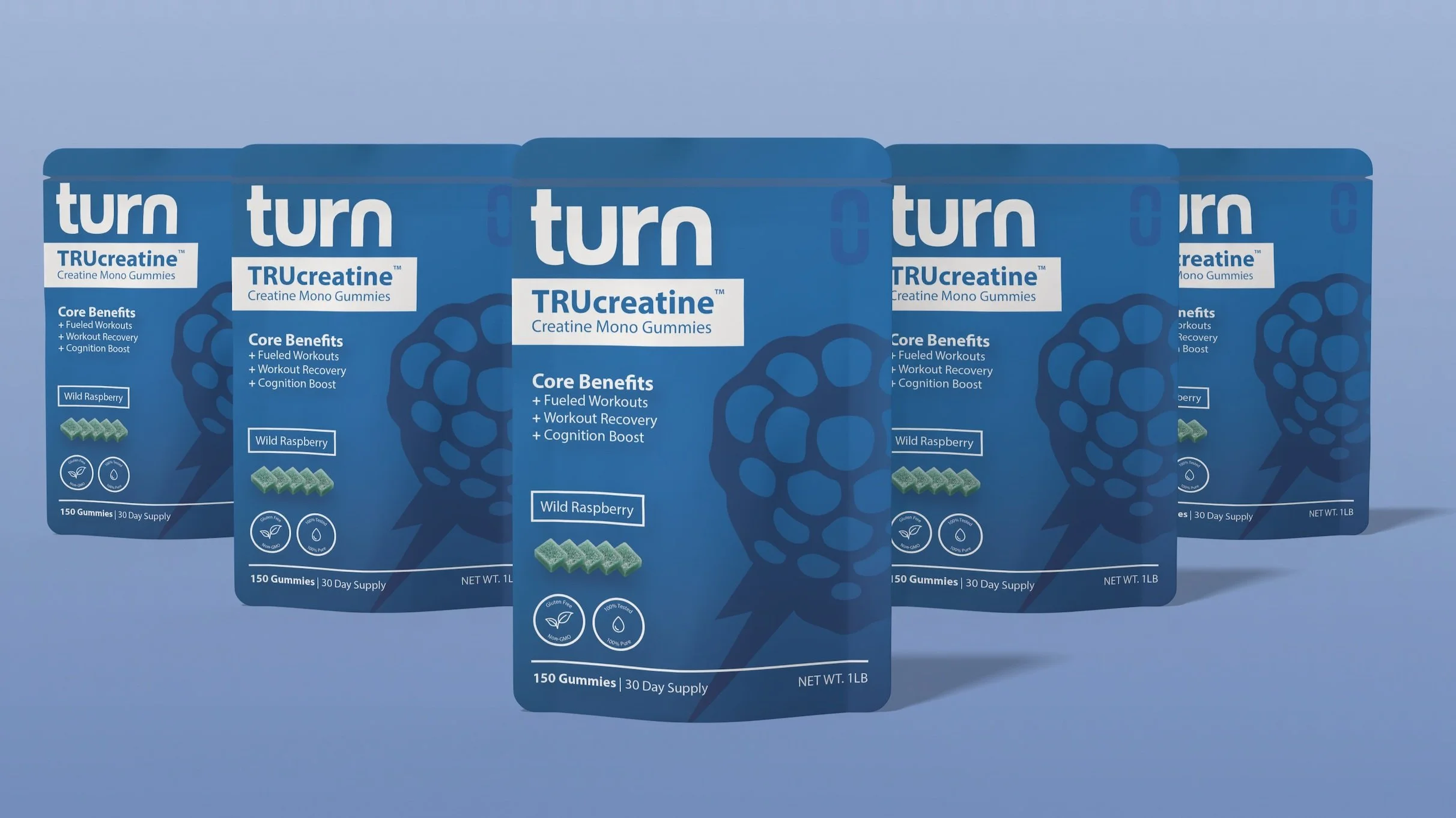
Clean, POWERFUL, shelf-popping design.
1: Scalable / Repeatable. Improved hierarchy. Elevated presence.
2: Appealing / Fits into the industry it was created to live within.